Revitalize your Data Storytelling
Simple, yet powerful technique

Hi friend,
How are you? Hope you’re doing well.
A few days ago, I delivered a half-day of Data Storytelling Workshop for a health & wellness company. The audience was comprised of marketing and analytics teams.
After setting the storytelling foundations, participants broke down into four teams and went through a simulation running priority data stories based on my 3-step process.
It made me think. There is a blind spot that people often don’t take advantage of.
Any good data story needs to have not just a core message, supporting numbers (graphs and charts), but also strong visuals to bring it to life.
A strong visual for data stories is the power of infographics.
Information + graphics.
Or put simply, a data-powered visual story.
How so?
An infographic is not a single bar chart or a nice icon; it’s a visual blend of storytelling text, data, and imagery designed to communicate complex information quickly, clearly, and engagingly.
You can use infographics in your reports, on social media, websites, and in presentations.
Back in May 2023, I shared:

These days, what used to take lots of time and money for a graphic design team to research and produce a viral infographic and monetize it through a primary sponsor, you can now easily do with AI.
There are several types you can choose from:
Statistical
Informational
Process
Did one about the firing & rehiring tale of Sam Altman in Nov 2023. No AI was used, but a base Canva infographic template I customized
Comparison
What should your prompt include?
I typically use ChatGPT Pro, Gemini Pro, or Google NotebookLM.
You can include:
Core data points you want your infographic to focus on.
Links to articles or research reports
The storyline or sequence
Core message or narrative you want to convey
Your brand color hex numbers
Optional: You can also ask to come up with a visual metaphor to better engage
Ready to boost your team’s AI storytelling skills?
Book a workshop!
Examples
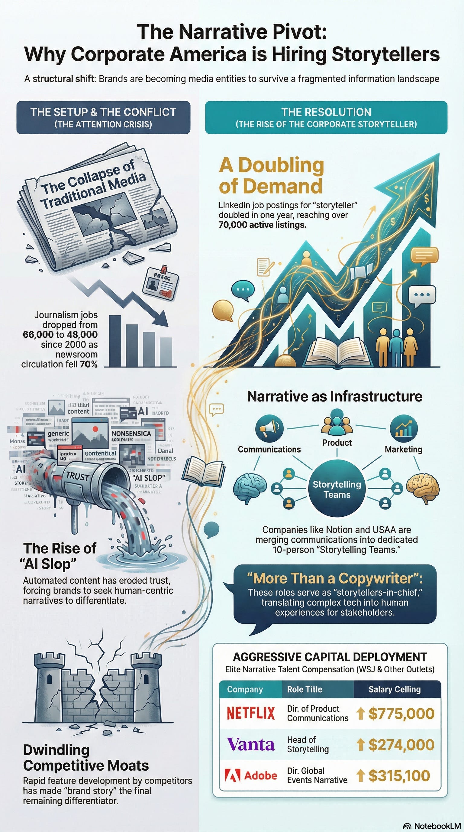
For this sequenced story, I used Google’s NotebookLM:

For a LinkedIn post, I used Google Gemini visual mode (AKA Nano Banana):

For a presentation slide, I used ChatGPT Pro visual mode:
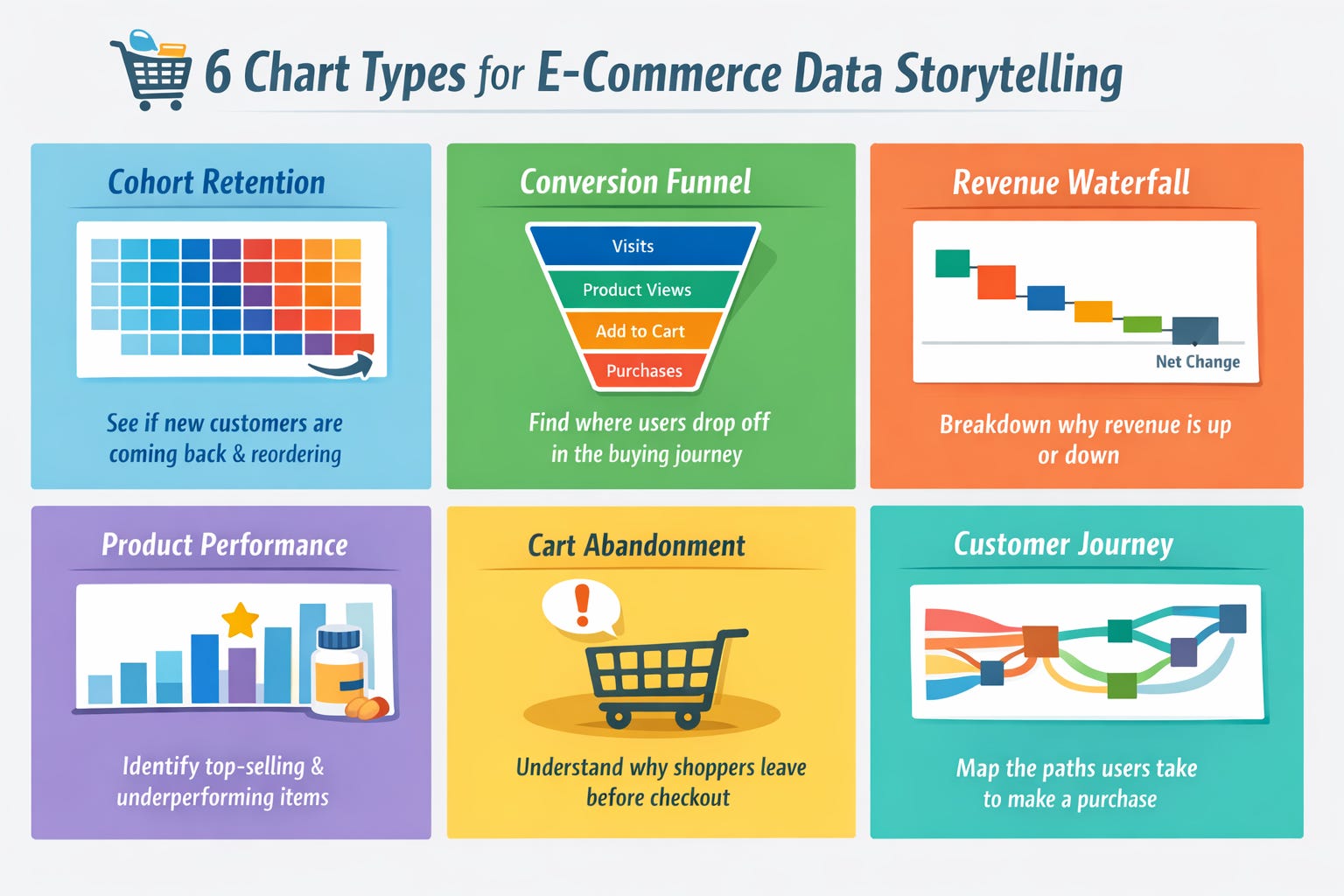
And for workspace comparison, I used ChatGPT Pro:

In short
Any time you’re looking to transform a busy slide, create a value-add compelling LinkedIn post, web page, or report - consider generating an infographic.
At that point, you’re in essence transitioning from telling to showing your key points.
You also gain the benefit that visuals are processed 60,000 times faster than text by the human brain and remembered 80% longer than what people read and hear.
Lastly, don’t forget to ABV = Always Be Validating the data the AI gives you. And of course, wrap it all around your authentic perspectives.
See you next time!
Best,
- Shlomi
Shlomi Ron
Founder, Visual Storytelling Institute
shlomi@visualstorytell.com | Follow me on Notes
story > visual > emotion > experience