

My Lessons from the Trenches
Tips to enhance your visual strategy

Hi friend,
How are you? I hope you’re doing well.
How are you using visuals in your storytelling? What production tactics work for you?
Through my work with clients and sharing my insights on media channels, including this newsletter, I have used a mixed visual strategy.
That means combining traditional handmade photos and sketches with stock, AI-generated images that I customize.
Here are vivid examples to illustrate this strategy, which you may find relevant to your approach:
Traditional Visualization
The core upside of all these techniques is that you have full control over the outcome. You’re not thrown into a rabbit hole of endless iterations when using AI chatbots.
You also feel a greater sense of ownership over the results.
The downside, of course, you’re limited to your creative expression capabilities.
1. Sketches
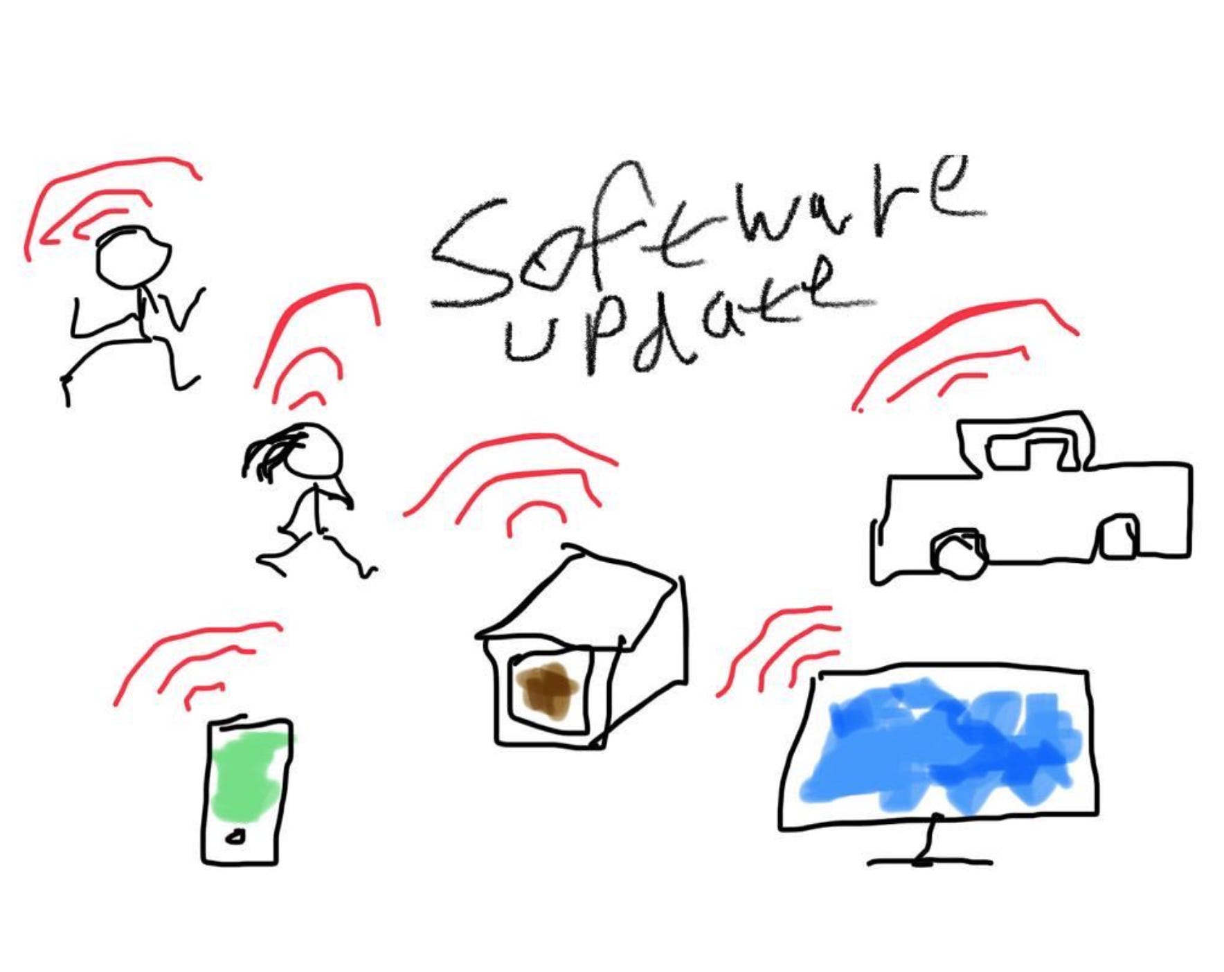
For a story I did about How Do You Software-Update Your Skills? I used a sketch app on my iPad and sketched the core idea.
Pretty crude, I know, but believable.
As you can see, the visual theme replicates the familiar “software update” radio waves icon used in various contexts - like smart TV, phone, or electric vehicle - and applies it to human learning.
To get a deeper view and learn from professional illustrators, check out:
The backstory behind the great work Penny Raile did for my book design, Total Acuity
My interview with NYTimes illustrator, Agnes Lee in How to Bring A Story to Life with Illustration?
2. Photos

For Tale of A Drowned Car story, I took this photo after coming across a real event of a drowned car and a crowd forming to see the process of the police getting the car out of the water.
The high authenticity value and the fact that this was a real event that carried practical visual storytelling tips - I think, make the step-by-step visual drama compelling.
As such, photos are great for documentary, product-in-context, customer stories, and much more.
3. Icons

If you browse my past stories here, you’ll see that I often use simple icons to convey the core message of a story.
Like in the story How About Some Human Touch?
I like this approach because of its minimalistic and clean design.
Since our eye is naturally drawn to look first at visuals before text, in one look, you get the gist.
